
Android 主题图标看不清?用双色背景验收单色遮罩
用单色轮廓、两个主题色和设备预览核对 Android 自适应图标的主题版本。
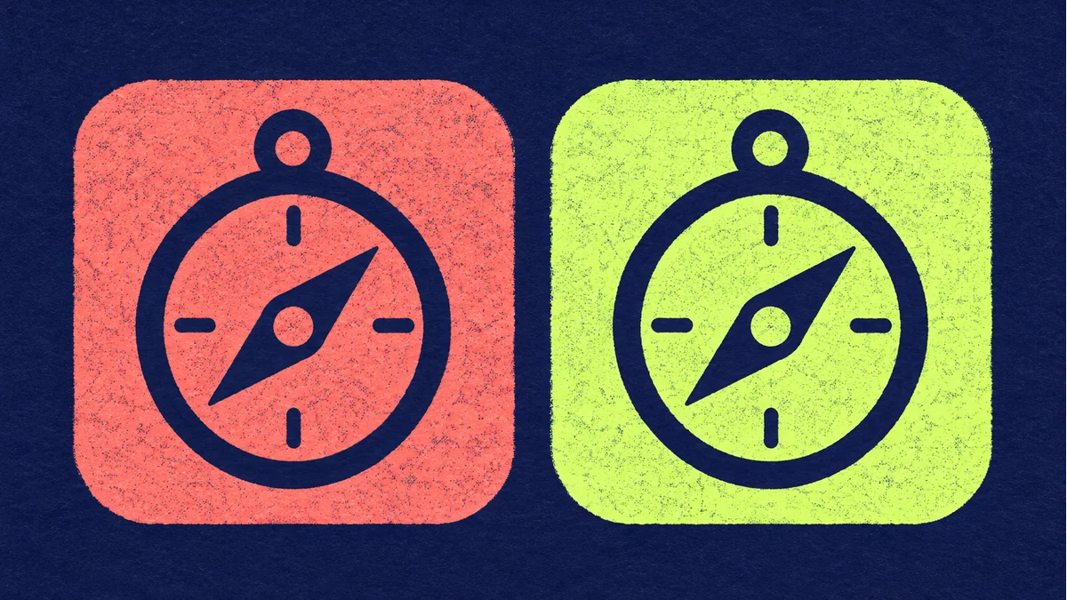
全彩图标清楚,开启桌面主题后却只剩一块色斑。常见原因是原图靠颜色区分内部结构,换成单色后这些分区失去对比。可以先用轮廓测试定位,再检查应用图标资源和设备设置。
把品牌识别压缩到单色轮廓
复制一份图标原稿,保留一个主形状和一个最重要的负空间。例如罗盘图案先保留外圈和斜针,去掉细刻度与渐变。按桌面上实际看到的大小缩小,分别放到浅底和深底上。若针和外圈黏连,先加宽间隔,再加装饰。
在同一台设备上做两组对照
- 按 Android 官方自适应图标文档准备应用的单色图层,并检查打包时实际引用的资源。
- 用支持主题图标的启动器,切换主题图标设置。记录系统版本、启动器及实际看到的图标。
- 更换一套反差明显的壁纸配色,再看轮廓和负空间是否还能区分。全彩图标也单独查看,确保它仍能辨识。
未看到主题效果时,优先排查启动器支持、设置和资源引用。能看到主题效果但轮廓难认,再回到单色稿修形。验收结果应写明在哪台设备和哪种设置下观察到。
素材准备入口:打开 Tooliva 工具。上述验收应在自己的工作文件和目标环境中完成。
推荐使用本站工具
How to Design Better Mobile App Icons for App Store and Google Play
Learn practical app icon design principles for better recognition, stronger store presentation, and cleaner iOS and Android exports.

Best Sound Effects to Create First for an Indie Game Prototype
A practical checklist of the most important game sound effects indie developers should create first, including UI clicks, pickups, hits, rewards, errors, transitions, and completion cues.
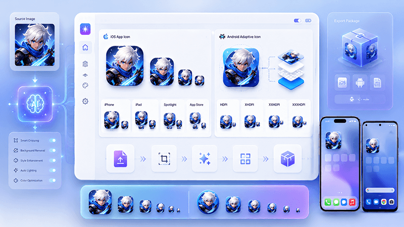
App Icon Generator Guide: Create iOS and Android Icons from One Image
Learn how an app icon generator turns one source image into iOS and Android icon sizes, adaptive icons, app store assets, and organized export files.