
Test the Monochrome Layer of an Android Themed Icon
Check negative space, two theme colors, and the installed icon before approving an Android launcher asset.
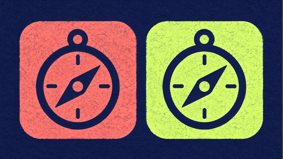
Your full-color icon may read well while its themed version looks like a solid blob. Color can separate shapes in the original art, but that contrast can disappear when the launcher applies a palette.
Reduce the artwork to a recognizable mark
Work from a duplicate. For a compass, keep the outer ring and the diagonal needle, then remove tiny tick marks and gradients. View it at the size it will occupy on the home screen. Put the same silhouette on light and dark backgrounds. If the needle merges into the ring, open the gap before adding details back.
Compare two theme palettes on an installed build
- Prepare the monochrome layer using Android's adaptive icon guide. Check which resource the build actually references.
- On a launcher that supports themed icons, toggle the setting and record what appears. Keep the OS version and launcher in the test notes.
- Change the wallpaper to get a contrasting palette and check the shape again. Inspect the regular icon separately.
If the palette never changes, check the launcher support, setting and resource reference first. If the icon changes colors but becomes hard to read, revisit its negative space. Record the tested launcher and settings when approving the result.
For asset preparation, open the Tooliva tool. Run the acceptance checks in your own working files and target environment.
Recommended tools
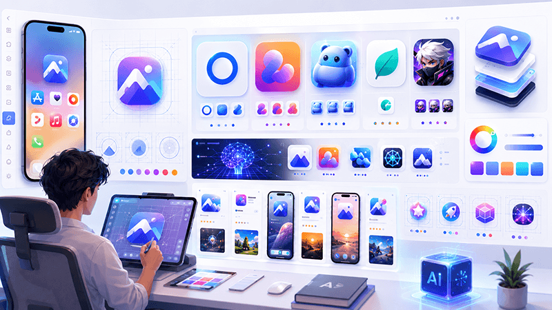
How to Design Better Mobile App Icons for App Store and Google Play
Learn practical app icon design principles for better recognition, stronger store presentation, and cleaner iOS and Android exports.

Best Sound Effects to Create First for an Indie Game Prototype
A practical checklist of the most important game sound effects indie developers should create first, including UI clicks, pickups, hits, rewards, errors, transitions, and completion cues.
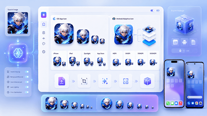
App Icon Generator Guide: Create iOS and Android Icons from One Image
Learn how an app icon generator turns one source image into iOS and Android icon sizes, adaptive icons, app store assets, and organized export files.
Ready to try "Test the Monochrome Layer of an Android Themed Icon"?
Use our online tools to apply this tutorial to your indie game project right away.